Apple releases new iOS 26.2 with several updates

1. Catchy Headline
iOS 26.2 Review: Apple Surrenders to User Backlash Over Controversial ‘Liquid Glass’ Design
2. “Brainx Perspective” (Intro)
At Brainx, we believe that design should never come at the cost of usability. The release of iOS 26.2 highlights a rare moment of humility from Cupertino, acknowledging that their futuristic “Liquid Glass” aesthetic pushed the boundaries of form too far, compromising function. This update is a pivotal course correction, signaling that user agency is finally taking precedence over rigid design dogma.
3. The News (Body)
Apple has officially rolled out iOS 26.2, a substantial update that addresses one of the most contentious design debates in the company’s recent history. Following the polarization caused by the initial “Liquid Glass” interface introduced in iOS 26, this latest version serves as both a refinement of the visual language and a peace offering to a frustrated user base.
While the update includes the usual suite of performance patches and feature additions, the headline story is the unprecedented level of customization Apple is now granting users over the operating system’s visual core.
The “Liquid Glass” Controversy: A Design Experiment Gone Wrong?
To understand the significance of iOS 26.2, one must look at the ambitious leap taken with the original iOS 26.
- The Vision: Apple attempted to redefine the digital interface with “Liquid Glass”—a hyper-modern aesthetic where buttons, notifications, and panels mimicked the physics of refractive glass. The goal was to prepare the ecosystem for a seamless transition to Augmented Reality (AR) and smart glasses.
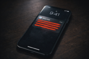
- The Reality: While visually stunning in marketing materials, the practical application was flawed. Users reported that the semi-transparent layers made text difficult to read, particularly against complex wallpapers.
- The Friction: Critical information, such as song titles in Apple Music or urgent notifications, became lost in a sea of blur and light refraction, leading to accessibility complaints.
Restoring Control: The Transparency Sliders
iOS 26.2 does not abandon Liquid Glass; instead, it tames it. Apple has introduced granular controls that allow users to dictate how the operating system looks and feels.
- Lock Screen Customization: Users can now specifically adjust the transparency of the Lock Screen clock and widgets. This ensures that time and data remain legible regardless of the background image.
- System-Wide “Frost” Slider: Building on the rudimentary tools of iOS 26.1, the new update refines the global slider. Users can shift the UI from “Clear Glass” (high transparency) to “Frosted Matte” (high opacity/contrast).
- Philosophy Shift: This move indicates that Apple is softening its “we know best” approach, allowing for a personalized balance between futuristic aesthetics and utilitarian needs.
The Leadership Shake-Up: Dye Out, Lemay In
The timing of this aesthetic pivot coincides with a major restructuring within Apple’s design leadership, suggesting a deeper philosophical change behind closed doors.
- The Departure: Alan Dye, the executive credited with spearheading the Liquid Glass overhaul, has left Apple to join Meta. His tenure was defined by bold, high-concept visual changes.
- The New Guard: Stephen Lemay has stepped into the role. A veteran of Apple’s interface and interaction design teams, Lemay is known for a more pragmatic, function-first approach.
- The Implication: Industry analysts suggest Lemay’s appointment is a strategic move to ground Apple’s design ambitions. The focus is shifting from “how it looks” to “how it works,” ensuring that future innovations do not alienate the core user base.
Beyond the Visuals: Feature Enhancements
While the visual tweaks have dominated the headlines, iOS 26.2 remains a feature-rich update aimed at productivity and ecosystem cohesion.
- Connectivity: Enhanced protocols for smoother handoffs between iPhone, iPad, and Mac, likely preparing for tighter integration with upcoming hardware.
- Productivity: Refinements to background processes to improve battery life and app state retention.
- Entertainment: Subtle tweaks to media players and streaming integration, ensuring that the visual “glass” effects no longer obscure content playback controls.
4. “Why It Matters” (Conclusion)
This development highlights a critical evolution in the relationship between tech giants and their users. For the common man, iOS 26.2 ensures that your device remains a tool for clarity, not confusion. It sets a precedent that even the world’s most stubborn design company will pivot when the user experience is at stake.
Deep Dive Analysis: The Era of Adjustable Aesthetics
(Detailed expansion for further context)
The release of iOS 26.2 marks a significant chapter in the ongoing narrative of User Interface (UI) history. For nearly two decades, Apple has dictated the visual trends of the entire tech industry. When Apple moved to “Skeuomorphism” (leather textures and wood grain) under Steve Jobs, the world followed. When Jony Ive flattened the world with iOS 7, the industry followed.
With Liquid Glass, Apple attempted to lead the next revolution—likely preparing the visual cortex of its users for an AR-first world where digital overlays must blend with physical reality. However, the pushback against iOS 26 proved that users are currently prioritizing legibility and cognitive ease over futuristic immersion.
The “readability crisis” of iOS 26 is reminiscent of the “thin font” complaints of iOS 7, but the resolution is different. In the past, users largely had to adapt to Apple’s changes. In 2026, Apple is adapting to the users. The introduction of transparency sliders is a tacit admission that accessibility is not a “one size fits all” metric. What looks sleek to a 25-year-old designer in Cupertino might be illegible to a 60-year-old user in a brightly lit park.
Stephen Lemay’s influence cannot be overstated here. By placing an Interaction Design veteran at the helm, Apple is signaling a return to the principles of Human-Computer Interaction (HCI) where the interaction—the tap, the swipe, the glance—is paramount. We can expect future updates under his guidance to prioritize:
- High Contrast Options: Making devices easier to use in direct sunlight.
- Cognitive Load Reduction: Simplifying complex menus that became cluttered during the “Glass” era.
- Predictive UI: Interfaces that adapt not just visually, but contextually based on user behavior.
Ultimately, iOS 26.2 saves the Liquid Glass aesthetic by making it optional. It allows those who love the futuristic look to keep it, while providing a safety hatch for those who simply need their phone to work. It is a victory for choice, and perhaps the most “Pro” feature Apple has added to the iPhone in years.


Leave a Reply